Stamped Concrete Patterns and Colors: A Visual Guide
One of the most common questions homeowners ask when they start researching stamped concrete is what it actually looks like in real life, not in a manufacturer's catalog.
The answer depends almost entirely on two decisions: the pattern you choose and the color combination you use. Get both right for your home and the finished surface looks like intentional, high-end hardscape. Get one wrong and the result feels off in a way that is hard to articulate but immediately visible.
This guide covers the patterns and finishes Drago Inc. actually installs in the Stockton area, the color combinations that work best in the Central Valley's climate and light conditions, and what to expect from each approach based on real projects we have completed locally.
The Stamped Concrete Patterns We Install
1. Brick and Cobblestone Patterns
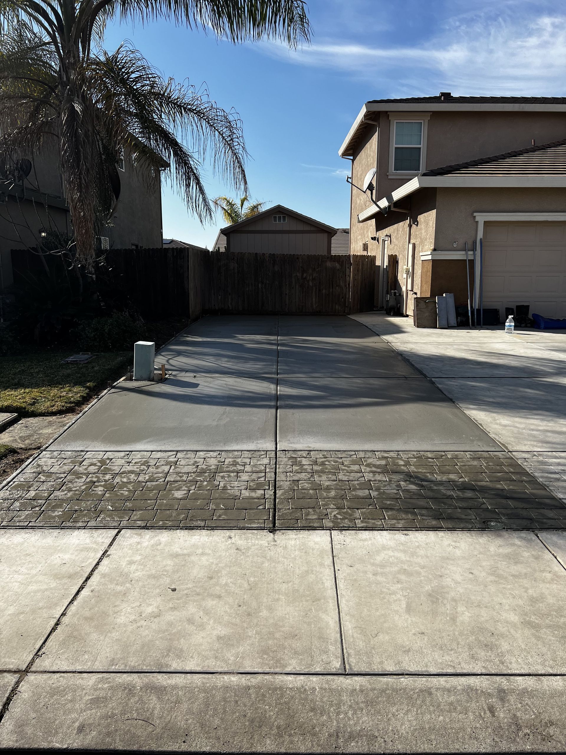
Brick and cobblestone are the most common stamped concrete patterns for driveways, and for good reason. They mimic one of the most recognizable and widely accepted hardscape looks, they scale well across large surfaces, and they read as traditional or modern depending on the color choices layered on top.
Brick patterns run in the familiar running bond layout, offset rows of rectangular units that create a horizontal rhythm across the surface. On a concrete driveway, this pattern reads as clean and structured from the street.
Cobblestone patterns use a smaller, more irregular unit shape that gives the surface a more textured, old-world character. The variation in the individual unit shapes creates visual complexity that reads as premium on wider surfaces like driveways and large patio areas.
Both patterns are excellent choices for driveways because the texture created by the stamping process adds traction beyond what a smooth concrete surface provides. In Stockton's wet winters, surface grip matters.
Best color pairings: Warm charcoal with a tan release agent, medium gray with a dark brown border, or a natural buff tone with a darker antiquing wash that highlights the pattern's edges.
2. Slate and Flagstone Patterns
Slate and flagstone patterns replicate the look of natural cut stone. Unlike the geometric regularity of brick, slate and flagstone stamps produce an irregular, organic pattern where no two units are the same shape. The result reads as natural and relaxed rather than formal.
Slate texture produces flatter, smoother units with defined edges. On a concrete patio, it reads almost like large-format tile. On a driveway, it gives the surface an upscale finish that is distinctly different from the standard gray slab look common on residential streets.
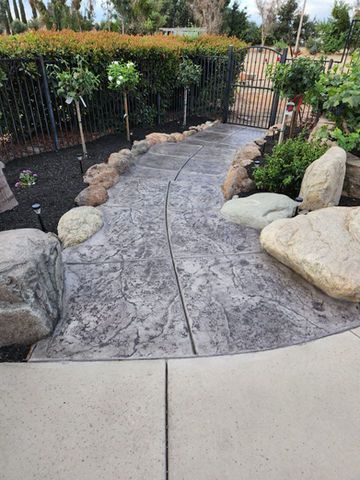
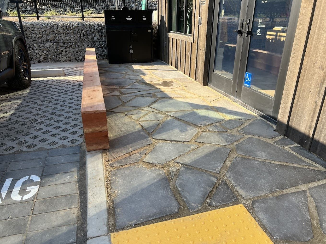
Flagstone patterns are more irregular and varied in unit size, mimicking the look of natural stone laid in a field pattern. This works particularly well for patios, pool surrounds, and walkways where the organic quality of the pattern complements surrounding landscaping and natural elements.
Best color pairings: Natural stone tones work best here. Warm sandstone, terracotta, and earthy beige combinations read as authentic. High-contrast colors like dark charcoal or black can work for a modern aesthetic but require careful execution to avoid looking artificial.
3. Wood Plank Patterns
Wood plank stamps reproduce the look of lumber planks, including realistic grain texture, across the concrete surface. This is one of the more distinctive pattern choices and works best in specific contexts: covered patio areas, outdoor living spaces adjacent to wood decking, or contemporary home exteriors where the contrast between the organic texture and the structural rigidity of concrete is part of the design intention.
On driveways, wood plank patterns are less common because the scale of a typical two-car driveway can make the plank repeat feel mechanical rather than natural. On patios and walkways, where the viewing distance is closer and the human scale of the space is smaller, the pattern reads well.
Best color pairings: Gray-brown tones that mimic weathered wood, warm cedar tones, or a cool driftwood gray. Avoid overly warm oranges or reds that push the concrete too far toward literal wood imitation.
4. Large-Format Tile Patterns
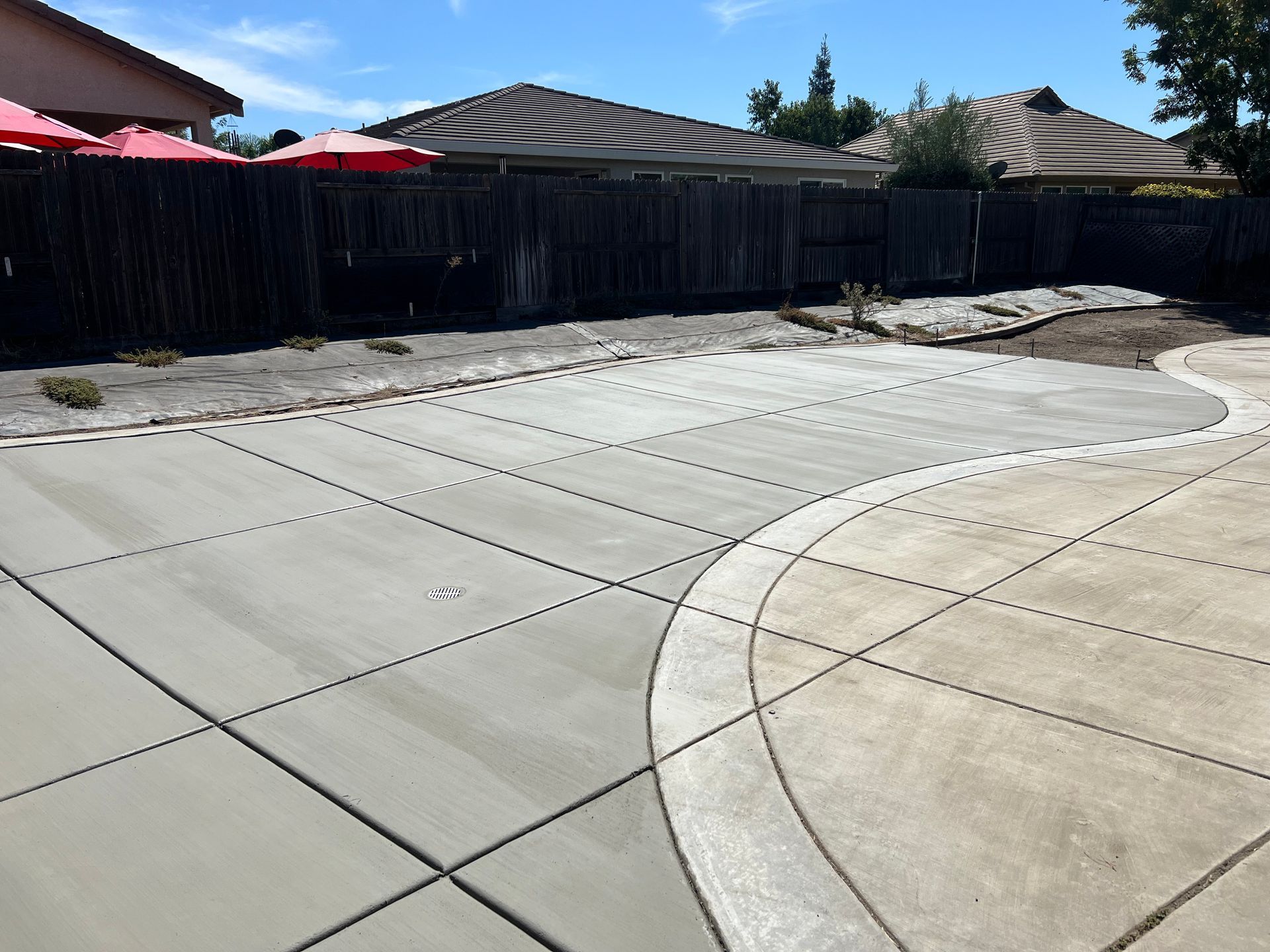
Large-format tile stamps produce clean, geometric units, typically squares or rectangles, with minimal texture variation between units. The result reads as contemporary and architectural rather than organic or traditional. This is the pattern choice for homeowners who want a clean, modern aesthetic over a decorative or rustic one.
On driveways, large-format tile creates a bold, graphic surface that stands out in neighborhoods where most driveways are plain gray slabs. On patios, it pairs well with modern home architecture, clean-line outdoor furniture, and minimal landscaping approaches.
Best color pairings: Cool grays, charcoal, or a warm white with a light gray joint color. This pattern loses its character with overly warm or busy color treatments. Clean and restrained is the right approach.
5. Exposed Aggregate
Exposed aggregate is technically not a stamped finish but belongs in any complete discussion of decorative concrete options because it is one of the most practical and visually distinctive choices available.
Rather than imprinting a pattern, exposed aggregate removes the top layer of cement paste after the pour to reveal the natural stone and gravel in the mix. The result is a textured, speckled surface that varies in appearance depending on the aggregate mix used. Rounded river rock produces a smooth, pebbled look. Angular crushed stone produces a rougher, more varied surface.
Exposed aggregate has excellent natural traction, which makes it particularly appropriate for pool surrounds, damp areas, and any surface where slip resistance is a priority. It also handles Stockton's heat well because the aggregate-dominant surface does not retain as much heat as darker stamped finishes.
Color considerations: The color of exposed aggregate surfaces comes primarily from the stone in the mix rather than from pigment. Selecting the aggregate mix determines the final appearance. Your contractor should be able to show you samples of different aggregate options before the pour.
6. Engraved and Saw-Cut Patterns
Engraving and saw-cutting create clean geometric lines, borders, and custom patterns by cutting into the concrete surface after it has cured. Unlike stamping, which happens during the pour, engraving and saw-cutting can be done on existing concrete as well as new installations.
This approach produces sharp, precise line work that stamping cannot replicate. Borders, geometric frames, custom medallions, and intricate patterns are all achievable with engraving. The lines can be left as cut, filled with a contrasting color, or used to create a faux tile or stone pattern across the surface.
Engraving is frequently used as an accent combined with another finish. A stamped concrete patio with an engraved border. A color-stained slab with saw-cut lines creating a tile pattern. The combination of techniques is where some of the most distinctive decorative concrete results come from.
The Color Combinations That Work in Stockton
Color is where most homeowners spend the least time researching and later wish they had spent more. The pattern creates the structure. The color determines whether the finished surface fits the home and the climate it sits in.
Here is what we have seen work and not work in the Stockton and Central Valley market specifically.
Terracotta and Warm Earth Tones
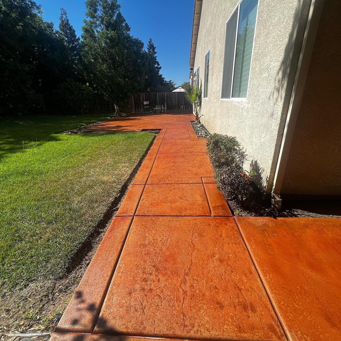
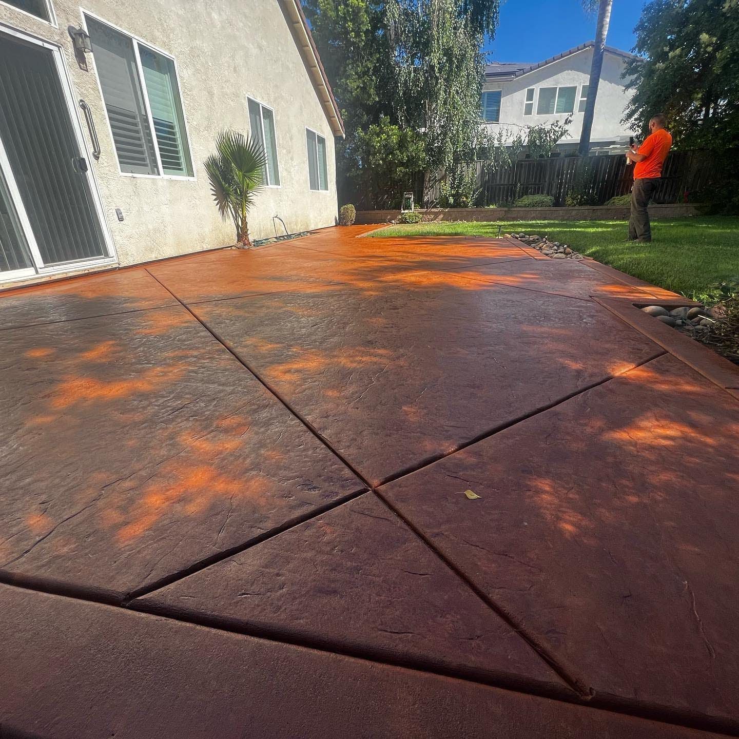
Deep terracotta orange, warm brick red, and burnt sienna tones are among the most successful color choices in the Stockton area. These colors align with the warm stucco exteriors common in the region, hold their richness in bright summer sun without washing out, and read as intentional rather than defaulted-to.
In one project we completed locally, we installed stamped concrete walkways and a patio in a deep terracotta tone. The color connected the outdoor surface to the home's warm exterior and created an outdoor space that felt like an extension of the house rather than a separate construction project.
Limitation: Darker terracotta surfaces absorb more heat in direct sun than lighter colors. For patios where bare feet are the norm on summer afternoons, a lighter variation of the same tone or a shaded placement reduces this significantly.
Beige and Warm Neutral with Contrasting Borders
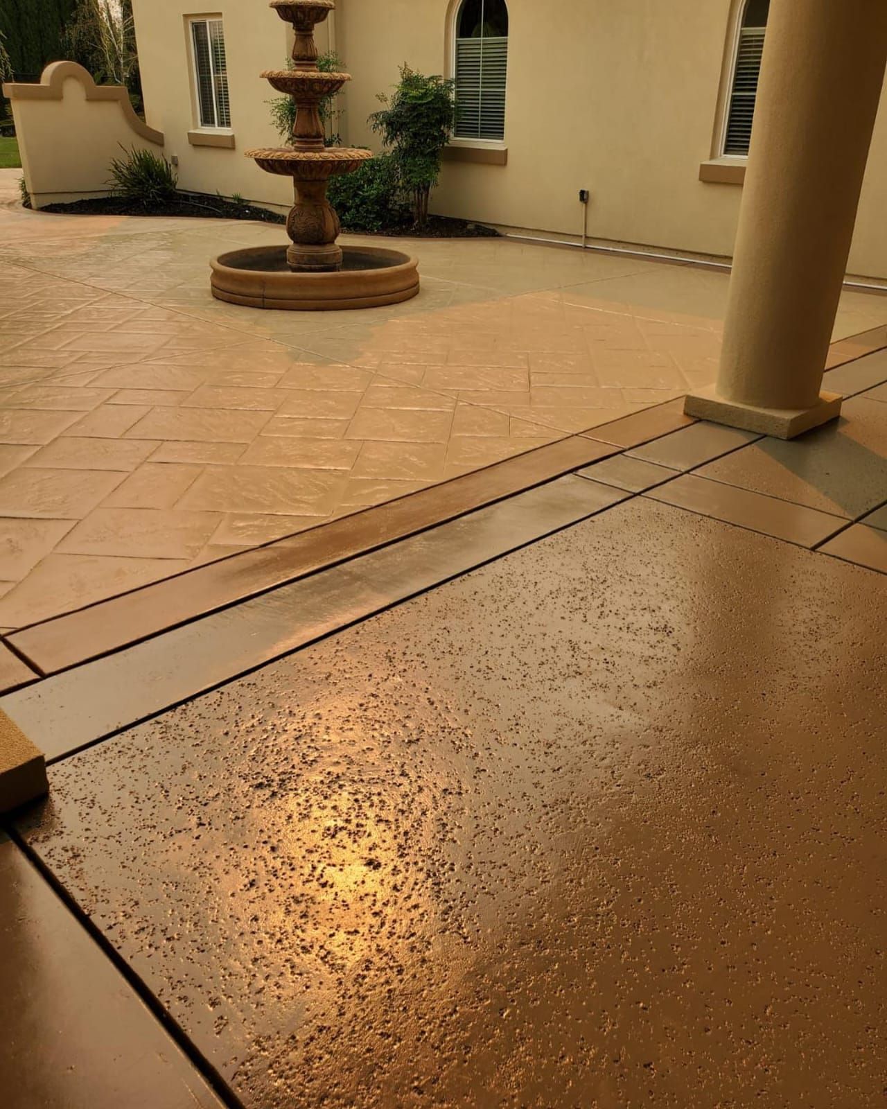
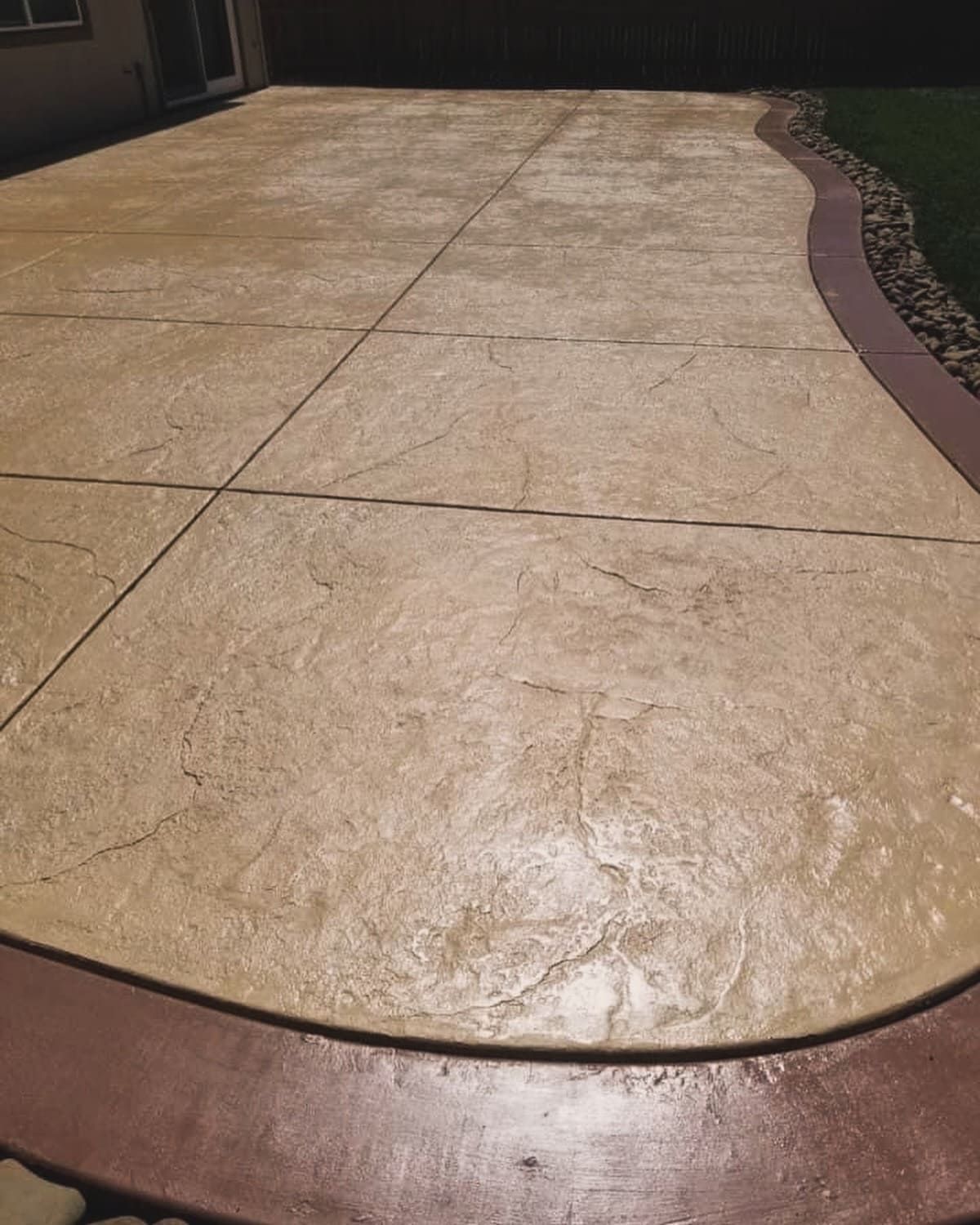
A light beige or sandy tone with a darker brown or charcoal border is one of the most versatile and consistently successful color combinations in residential decorative concrete. The neutral field color works with almost any home exterior and reads as open and spacious. The contrasting border frames the slab and gives it a finished, designed quality that a single-color pour does not have.
In one local project, we poured a stamped patio in a light beige with a darker brown border running the perimeter. Combined with decorative rock and artificial turf in the surrounding yard, the result was a cohesive backyard where every element related to the others visually.
Why this combination works: Beige reflects more heat than terracotta or charcoal, which matters in Stockton's summers. The two-tone approach adds design interest without requiring a complex color execution. And lighter neutral tones are the most flexible backdrop for outdoor furniture, planters, and landscaping choices that may change over time.
Tan with Lighter Borders as an Accent
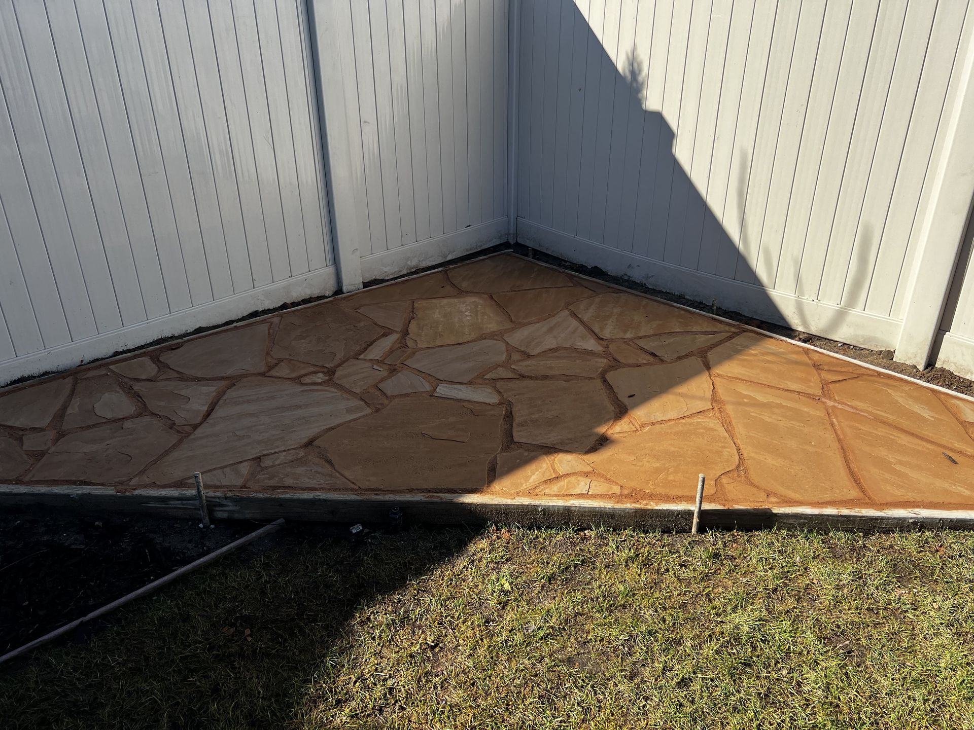
A warm tan field color with a lighter cream or off-white border creates a soft, sun-appropriate palette that reads well in California light. This combination works particularly well for accent features within a larger patio, a defined corner, a walkway section, or a decorative element within a mostly plain concrete surface.
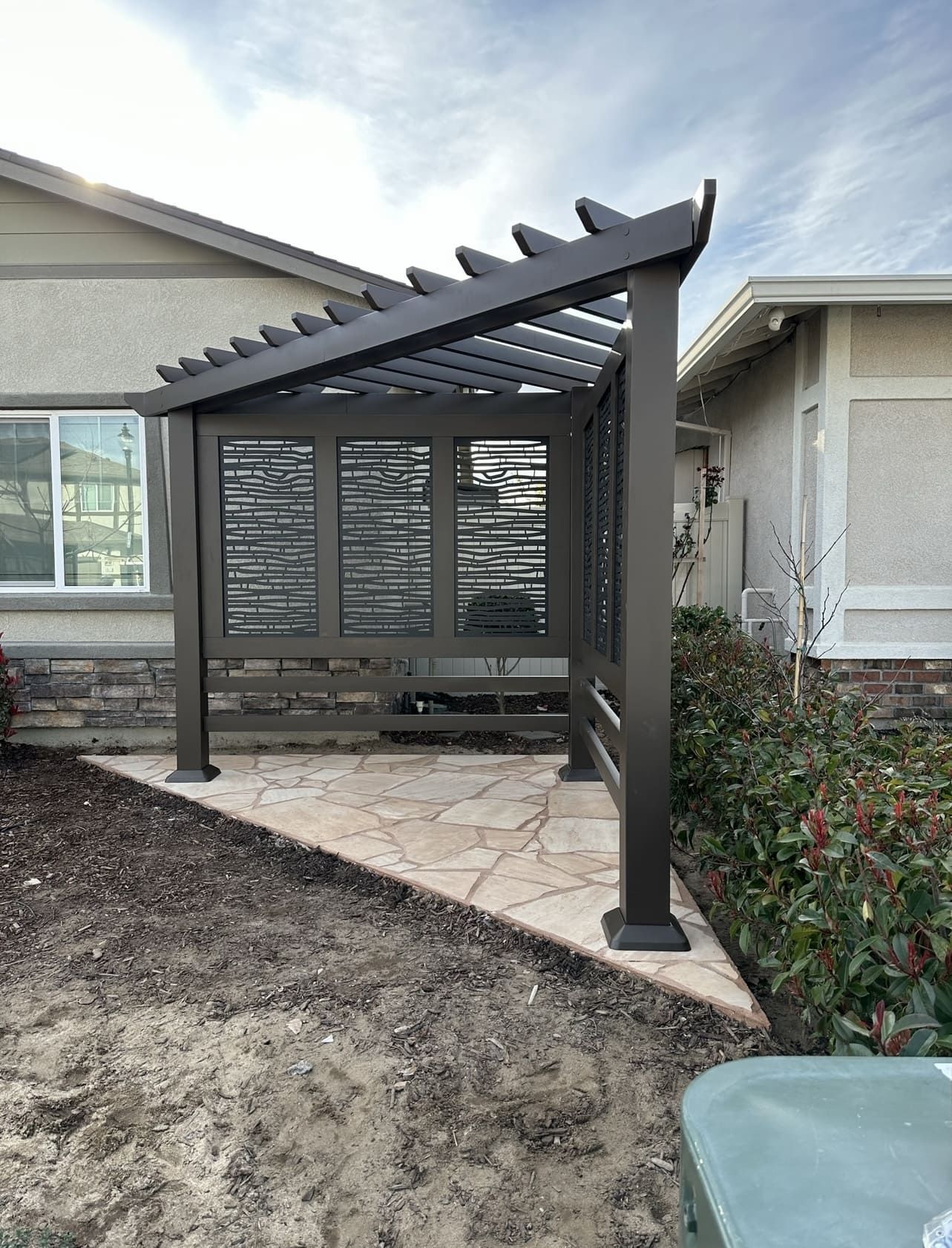
In one project we built locally, this combination was used as a patio corner accent feature. The tan and lighter border created a focal point within the outdoor space without requiring the full patio to be stamped, which kept the project within budget while still achieving a distinctive visual result.
Best application: Accent features, defined zones within a larger patio, walkways. The lighter palette shows staining more readily than darker tones on full driveway applications, so sealing is especially important with this color choice.
Gray and Charcoal Tones
Cooler gray and charcoal tones are increasingly common in contemporary residential projects. They pair well with modern home architecture, work with a wide range of landscaping palettes, and read as clean and deliberate.
The practical consideration in Stockton is heat absorption. Dark charcoal surfaces in full sun reach higher surface temperatures on summer afternoons than lighter tones. This is worth discussing at the design stage if the surface will see barefoot use during peak heat.
Gray tones also show tire marks and oil staining more readily on driveways than warm earth tones, which is worth factoring into a driveway color decision specifically.
How to Choose the Right Pattern and Color for Your Project
A few questions that simplify the decision:
What is your home's exterior color? The concrete surface should relate to the home. Warm stucco tones favor warm concrete colors. Cooler gray or white exteriors open up the range. A color that fights the home's exterior is visible every time you pull into the driveway.
How much sun does the surface get? Full-day direct sun in Stockton's summers pushes toward lighter colors for surfaces used barefoot. Shaded patios and covered areas have more flexibility with darker tones.
What is the primary use? Driveways prioritize pattern traction and stain resistance in color choice. Patios prioritize aesthetics and comfort underfoot. Pool surrounds prioritize grip above all else.
What is around it? Landscaping, fencing, exterior lighting, and nearby hardscape all affect how a color reads in context. Looking at the full yard environment, not just the slab footprint, is how you avoid a color choice that looks right on a sample board and wrong in the finished yard.
What to Expect During a
Decorative Concrete Project
Design stage: We walk the site, discuss pattern and color options, and show samples. Color looks different in Stockton's outdoor light than it does inside a showroom or on a small chip. Seeing samples on site is how you make a confident color decision.
Base preparation: The same base requirements apply to decorative concrete as to standard concrete. Proper excavation, compacted aggregate base, and correct form work happen before any decorative decisions affect the process.
The pour: Color hardener or integral color is applied during the pour. Stamps are pressed into the surface while the concrete is still workable. Timing is everything here. The window for stamping is determined by the concrete's set speed, which is affected by temperature and mix design. Hot Stockton summer days accelerate set time, which is why experienced contractors manage pour timing carefully in summer months.
The release agent: A powder or liquid release agent applied before stamping prevents the stamps from sticking to the surface and adds a subtle secondary color variation that highlights the pattern's texture and depth. The release agent is one of the main variables in how much contrast and dimension the finished surface has.
Curing and sealing: After the pour, the concrete cures and the sealer is applied. The sealer protects the color, the surface texture, and the long-term performance of the slab. It also determines the final sheen level, from matte to high gloss, which significantly affects how the color reads in outdoor light.
Get a Stamped Concrete Estimate in Stockton
If you are planning a stamped concrete driveway, patio, or walkway in the Stockton area, we can walk your property, show you real pattern and color options, and give you a detailed estimate before you commit to anything.
Drago Inc. serves Stockton, Manteca, Tracy, Lodi, Lathrop, and surrounding communities throughout San Joaquin County.
Call us at (209) 871-8110 or request a free estimate online.
Frequently Asked Questions
-
What are the most popular stamped concrete patterns?
Brick, cobblestone, slate, and flagstone are the most commonly installed patterns in residential applications. Brick and cobblestone are most common on driveways. Slate and flagstone are popular for patios and pool surrounds. Large-format tile and wood plank patterns are growing in popularity for contemporary home styles.
-
What colors are available for stamped concrete?
The range is wide. Common choices for the Stockton and Central Valley market include warm earth tones such as terracotta, brick red, and sandy beige, neutral tones including various shades of gray and charcoal, and two-tone combinations where a field color is paired with a contrasting border or antiquing wash. Color is applied through integral pigment in the concrete mix, color hardener applied to the surface during the pour, or a combination of both.
-
Does stamped concrete look fake?
Quality stamped concrete installed with the right pattern scale, color choices, and release agent technique reads as realistic in person. Pattern choices that are too small for the surface scale, colors that are too uniform without variation, or a sealer sheen that is too glossy are the most common reasons stamped concrete looks artificial. Seeing real local project examples from your contractor before committing to a design is the best way to calibrate expectations.
-
How long does stamped concrete color last?
Color protected by a quality sealer maintained on a regular schedule holds well for many years. In Stockton's UV-intense climate, resealing every two to three years is the appropriate interval. Unsealed or under-sealed stamped concrete fades more noticeably than protected surfaces, particularly in full sun exposure.
-
Can stamped concrete be customized with multiple colors?
Yes. Two-tone and multi-tone approaches are common and often produce the most visually interesting results. A field color plus a contrasting border, a base color plus an antiquing wash that highlights the pattern's depth, or a combination of stain and color hardener all produce layered color effects. This is worth discussing at the design stage since multi-tone applications require specific sequencing during the pour.
-
How does stamped concrete hold up on driveways specifically?
Stamped concrete on a properly installed driveway, correct slab thickness, appropriate PSI, rebar reinforcement, and a good base, performs as durably as plain concrete. The pattern is pressed into the surface during the pour and does not create any structural weakness. Sealing is more important on stamped driveways than on plain concrete because the texture of the pattern creates more surface area for water and contaminants to contact.
-
What is the difference between stamped concrete and regular concrete?
Structurally they are the same material built the same way. The decorative elements, pattern, color, and texture, are applied during the pour process and do not change the concrete's structural properties. The difference is entirely in the surface finish and the additional steps, color application, stamping, and sealing, that produce it.
Drago Inc. is a licensed (CSLB #1017023) and insured concrete contractor serving Stockton, Manteca, Tracy, Lodi, Lathrop, and surrounding San Joaquin County communities since 2016. Learn more about our concrete patio services or contact us for a free estimate.
Share Now!